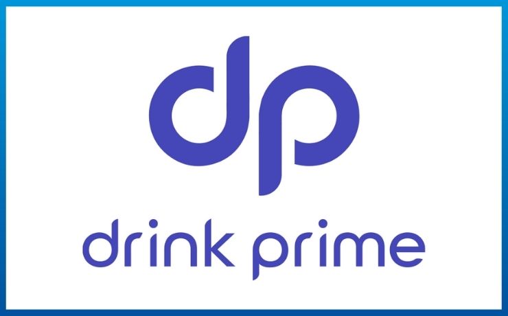
DrinkPrime announces the rebranding of its logo in-line with the brand’s next growth phase. The newly conceptualized brand ideated logo, developed by a team at DrinkPrime aims to resonate with the company’s new processes and develop a streamlined vision amongst the audiences.
Speaking on the rebranding effort, Vijender Reddy Muthyala, Co-founder and CEO, DrinkPrime shares, “We are a startup that is rapidly growing and aim to reach a million subscribers in the next five years. We not only intend to ramp up the subscriber base in the cities that we are already in but also aim to expand to 16 new cities in the next 36 months. At every point in our journey, it is important for us to bring the DrinkPrime family closer to the mission. By rebranding, we have created a brand identity that resonates with our mission and vision for the next phase of our journey.”
The rebranding will ensure that a unified message can be passed amongst the audience, spreading awareness on the importance of clean drinking water for all. The aim is to develop a brand image that the company’s logo becomes a synonym for clean and fresh water.
With a resolution to resolve the problem of safe drinking water, Manas Ranjan Hota, Co-founder, and COO, DrinkPrime comments, “India faces a major problem for inadequate access to clean drinking water. Approximately 50 million people in 15 cities in India do not have access to safe drinking water. On the other hand a major population does not have access to water purifiers, the figures go as low as 5% of the Indian population. Hence, our vision is to develop a brand identity that becomes a part of every household in the country. Additionally, the simplicity of the logo will help us to create an identity that easily connects with the audience”.
According to Manas, the newly adopted brand colour, purple, has a warmth just like the DrinkPrime brand. He adds, “It is a combination of blue, the colour that represents calm stability, and red, the colour that is vibrant and energetic.”
Along with the new branding, DrinkPrime revises the subscription model to provide easy access to its customers. This will make safe drinking water more affordable in line with its mission of increasing access to drinking water.
Read Also : Tread.fit rebrands as Cultbike.fit
Disclaimer: Information mentioned here has not been verified or endorsed by Agency Reporter and is in accordance with the press release shared by the company or their appointed representatives.


