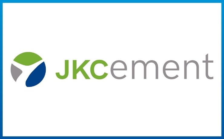
JK Cement unveils a refreshed corporate identity, with a brand new logo. Raghavpat Singhania, Managing Director – JK Cement, Madhavkrishna Singhania – Dy. MD and CEO, JK Cement and A.K. Saraogi – Dy. MD & CFO revealed the new corporate logo at a special virtual event. The new identity aims to usher in a new era of leadership and innovation for the brand while staying true to the core brand values.
The new corporate logo also aims to depict the core values of the company. The new logo has a refreshing color palette of green, blue, and grey, with each color holding a significant meaning. Green represents JKCement’s vision for sustainability, grey is for the Company’s grey cement business – its strength and solid foundation, and the blue in the logo signifies its white cement business.
Raghavpat Singhania, Managing Director – JK Cement says “I am extremely happy that our new logo commemorates our mentor and guide, Late Shri Yadupati Singhania Ji’s memory while embodying our Organization’s vision for the future. He was a true visionary and a champion of change, who believed that, to be leaders we have to be the ‘first into the future. At JKCement, we have always been committed to creating value for all our stakeholders. We have been a forerunner in adopting innovative best practices which have helped us to stay ahead of the curve and successfully navigate many difficult situations, even during the pandemic. We wanted to introduce a symbol that represents Yadupati Ji’s vision, values, and legacy. The alphabet ‘Y’, the central theme of the symbol is inspired by him and it is his vision that has propelled JKCement towards continuous growth. Our new corporate logo not only encapsulates the very essence of our brand while giving it a fresh dimension but also renders it a contemporary and differentiated identity.”
Madhavkrishna Singhania, Dy. MD and CEO, JKCement, points, “The symbol ‘Y’ in our new visual identity is inspired by the metaphor that the ‘tree’ represents – the tree of abundance, which beautifully captures the philosophy of our organization. It also pays homage to Late Shri Yadupati Singhania Ji who strived to create a beneficial ecosystem for all our stakeholders to succeed and thrive in. He nurtured JKCement into an organization with a solid foundation of trust and one that gives back selflessly to society. Our new corporate identity reflects our core ethos and our ongoing mission of transformation and we hope to take Yadupati Ji’s legacy of excellence and humility forward with this new and exciting chapter in our brand journey.”
The corporate brand transformation of JKCement is supported by a 360 degree integrated campaign encompassing print, digital and social media, on-ground brand visibility, public relations.
Read Also : Bombay Shaving Company appoints R Ashwin as Brand Ambassador; releases Omni-Channel campaign #ShaveToShine
Disclaimer: Information mentioned here has not been verified or endorsed by Agency Reporter and is in accordance with the press release shared by the company or their appointed representatives.


